From the Canyon Edge -- :-Dustin

Tuesday, August 27, 2013

Ubuntu Fun with $PS1

tl;dr? 
From within byobu, just run:
byobu-enable-prompt

Still reading?

I've helped bring a touch of aubergine to the Ubuntu server before.  Along those lines, it has long bothered me that Ubuntu's bash package, out of the box, creates a situation where full color command prompts are almost always disabled.

Of course I carry around my own, highly customized ~/.bashrc on my desktop, but whenever I start new instances of the Ubuntu server in the cloud, without fail, I end up back at a colorless, drab command prompt, like this:


You can, however, manually override this by setting color_prompt=yes at the top of your ~/.bashrc, or your administrator can set that system-wide in /etc/bash.bashrc.  After which, you'll see your plain, white prompt now show two new colors, bright green and blue.


That's a decent start, but there's two things I don't like about this prompt:
  1. There's 3 disparate pieces of information, but only two color distinctions:
    • a user name
    • a host name
    • a current working directory
  2. The colors themselves are
    • a little plain
    • 8-color
    • and non-communicative
Both of these problems are quite easy to solve.  Within Ubuntu, our top notch design team has invested countless hours defining a spectacular color palette and extensive guidelines on their usage.  Quoting our palette guidelines:


"Colour is an effective, powerful and instantly recognisable medium for visual communications. To convey the brand personality and brand values, there is a sophisticated colour palette. We have introduced a palette which includes both a fresh, lively orange, and a rich, mature aubergine. The use of aubergine indicates commercial involvement, while orange is a signal of community engagement. These colours are used widely in the brand communications, to convey the precise, reliable and free personality."
With this inspiration, I set out to apply these rules to a beautiful, precise Ubuntu server command prompt within Byobu.

First, I needed to do a bit of research, as I would really need a 256-color palette to accomplish anything reasonable, as the 8-color and 16-color palettes are really just atrocious.

The 256-color palette is actually reasonable.  I would have the following color palette to chose from:


That's not quite how these colors are rendered on a modern Ubuntu system, but it's close enough to get started.

I then spent quite a bit of time trying to match Ubuntu color tints against this chart and narrowed down the color choices that would actually fit within the Ubuntu design team's color guidelines.


This is the color balance choice that seemed most appropriate to me:


A majority of white text, on a darker aubergine background.  In fact, if you open gnome-terminal on an Ubuntu desktop, this is exactly what you're presented with.  White text on a dark aubergine background.  But we're missing the orange, grey, and lighter purple highlights!


That number I cited above -- the 3 distinct elements of [user, host, directory] -- are quite important now, as they map exactly to our 3 supporting colors.

Against our 256-color mapping above, I chose:
  • Username: 245 (grey)
  • Hostname: 5 (light aubergine)
  • Working directory: 5 (orange)
  • Separators: 256 (white)
And in the interest of being just a little more "precise", I actually replaced the trailing $ character with the UTF-8 symbol ❭.  This is Unicode's U+276D character, "MEDIUM RIGHT-POINTING ANGLE BRACKET ORNAMENT".  This is a very pointed, attention-grabbing character.  It directs your eye straight to the flashing cursor, or the command at your fingertips.


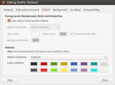
Gnome-terminal is, by default, set to use the system's default color scheme, but you can easily change that to several other settings.  I often use the higher-contrast white-on-black or white-on-light-yellow color schemes when I'm in a very bright location, like outdoors.


I took great care in choosing those 3 colors that they were readable across each of the stock schemes shipped by gnome-terminal.


I also tested it in Terminator and Konsole, where it seemed to work well enough, while xterm and putty aren't as pretty.

Currently, this functionality is easy to enable from within your Byobu environment.  If you're on the latest Byobu release (currently 5.57), which you can install from ppa:byobu/ppa, simply run the command:

byobu-enable-prompt

Of course, this prompt most certainly won't be for everyone :-)  You can easily disable the behavior at any time with:

byobu-disable-prompt

While new installations of Byobu (where there is no ~/.byobu directory) will automatically see the new prompt, starting in Ubuntu 13.10 (unless you've modified your $PS1 in your ~/.bashrc). But existing, upgraded Byobu users will need to run byobu-enable-prompt to add this into their environment.

As will undoubtedly be noted in the comments below, your mileage may vary on non-Ubuntu systems.  However, if /etc/issue does not start with the string "Ubuntu", byobu-enable-prompt will provide a tri-color prompt, but employs a hopefully-less-opinionated primary colors, green, light blue, and red:


If you want to run this outside of Byobu, well that's quite doable too :-)  I'll leave it as an exercise for motivated users to ferret out the one-liner you need from lp:byobu and paste into your ~/.bashrc ;-)

Cheers,
:-Dustin

Thursday, August 22, 2013

Gentlemen, Start Your Engines!


Mark kicked this Ubuntu Edge campaign off a month ago with an analogy that's near and dear to my heart, as an avid auto race fan.  He talked about how the Ubuntu Edge could be a platform like Formula 1 race cars, where device manufacturers experiment, innovate, and push the limits of the technology itself.

Late yesterday, the Ubuntu Edge crowd funding campaign closed its 30-day run, without hitting its $32M goal.  That's a bummer, because I still want a PC that fits in my pocket, and happens to make phone calls.  There are at least 27,488 of us who pledged our support, and are likely bummed too.


In retrospect, I think there's a better analogy for the Edge, than Formula 1...  Time will show that the Edge worked more like a Concept Car.

"A concept vehicle or show vehicle is a car made to showcase new styling and/or new technology. They are often shown at motor shows to gauge customer reaction to new and radical designs which may or may not be mass-produced. General Motors designer Harley Earl is generally credited with inventing the concept car, and did much to popularize it through its traveling Motorama shows of the 1950s.Concept cars never go into production directly. In modern times all would have to undergo many changes before the design is finalized for the sake of practicality, safety, the meeting the burden of regulatory compliance, and cost. A "production-intent" vehicle, as opposed to a concept vehicle, serves this purpose.[1]"
I love reading about the incredible concept cars unveiled at the Detroit Auto Show every year, particularly as a Corvette and Cadillac enthusiast myself.


I think the Cadillac Cien (2002) is my favorite concept car of all time.  It's a beautifully striking vehicle, with edgy design, and crazy stupid power (750hp!).


While never mass produced, the Cien captured the imagination and updated the innovation around the Cadillac brand itself.  That concept vehicle, in a few short years, evolved in the production car I drive today, the Cadillac CTS-V -- a very different Cadillac than the land yachts your grandparents might lull around in :-)


This car has invigorated a generation of new Cadillac owners for General Motors, competing with long established players from BMW (M5), Mercedes (E63), and Audi (S6), and recapturing a valuable market of younger drivers who have been buying German performance sedans.

Without a doubt, I'm disappointed that I won't be holding this beautiful piece of hardware, at, all told, a very reasonable price (I pledged for two at the $600 level).


But that's only half of the story.  Ubuntu Touch, the software that would have powered the Edge, lives!!!

I'm actually running it right now on an LG E960 Google Nexus 4.  The hardware specs are pretty boring, and the device itself is not nearly as sexy as the Edge, but it's a decent run-of-the-mill, no-frills mobile phone that exists in the market today.


The unlocked, international version showed up on my doorstep in 18 hours and $394 from Amazon.  Amazingly, it took me less than 30 minutes to unbox the phone, download and install the phablet-tools on my Ubuntu 13.04 desktop, unlock the device, and flash Ubuntu Touch onto it.  There's so much potential here, I'm still really excited about it.

We are told, with confidence, that there will be Ubuntu smartphones in the market next year.  It just won't be the Edge.  As much as I lust to drive one of these elite Cadillac Cien concept cars, I love what it evolved into, and it's pure joy to absolutely drive the hell out of a CTS-V ;-)  And along those lines, this time next year, many of us will have Ubuntu smartphones, even it they won't be the Edge concept.

Gentlemen, start your engines!

Dustin

Printfriendly